Tuesday, 7 May 2019

OUGD505 End of Module Evaluation


Looking back at this briefs and the tasks set, I believe I have delivered what was asked of me in terms of producing a Map focusing on a topic of my choice and a body of work that addresses an economical, ethical or environmental issue of choice.

I feel like I didn’t manage my time as well as I could have. Ideas generation was quite easy for Studio brief two, with studio brief one being a bit harder but after a bit of help advice in crits I was able to focus and develop a piece of work I’m happy with. I had a clear vision in mind from quite early on as to what I wanted to create regarding studio brief two, once I had chosen my topic. I feel the extensive research we were required to do and present in SB2 really helped inform my ideas and helped me decide where I wanted to go with it.

The tutors have been around and are always available for advice when needed. They have been helpful and have given me ideas when needed which have helped me further develop my work. It was easy to ask for advice on what works best if need be and I’ve been able to use peer feedback to help develop my work.

I felt there was enough time on this project to produce something of better quality, I acknowledge my own time management on this brief was poorer than It should have been. I’ve felt almost drowned in work at times  this year and I know that is partly due to my own time management on this module which has been poorer than it should have been, although the poor time management has often stemmed from the feeling of being stressed and often times overwhelmed. The last couple of weeks have been relatively free to focus on this module which has really helped. Having said this, I’m overall happy with my end products but feel with better time management I could have definitely produced something of better quality and something more substantial.

I feel my time management across the whole module could definitely improve. I feel like I need to ask for advice on how to develop my work and develop a broader range of research that will improve my overall grade as I’m currently not happy with how I’m performing.

If I was to visit this project again I would be better prepared with time management. I wasn’t happy with my time management and will always try to improve upon this. I would also make sure I’m consistently blogging as I feel this is one of things I need to improve upon the most. With extra guidance on the research and experimentation side of my work, it may allow me to work in a way that forces me to blog on a more consistent basis.  I would give myself more time to experiment with my ideas, maybe allow myself to take more risks with more time to correct or improve anything. Even though I’m happy with my outcomes, giving myself more time to experiment with my ideas more for across all three studio briefs would result in better outcomes. Although I’m overall happy with my outcomes it’s always good to improve upon that and gather even more research to be able to develop more ideas and produce better outcomes. I want to take this advice generally but especially take this into next year, I know at times my ability can be better than the things I produce and sometimes I’m just not satisfied by the quality of work I put out and I know with better time management, research and experimentation I can produce better work and continue to develop a clear style in my work which I what I aim to do.

OUGD505 SB2 Final Outcome


This is the final visual identity for my “Don’t Avoid it” Campaign to generate awareness and probe the more healthy, open discussion of men’s mental health.

The project centres around the theme of ‘not avoiding,’ the idea of not avoiding the very real issue of men’s mental health and physically not being able to avoid the campaign that’s intent is to be widespread in the city of centre of Leeds. 

The project is made up of the campaign with its core ideas and a consistent visual identity across various mediums that support, relate to and advertise the campaigns ideas through minimalist design, colour theory techniques and mainly typographic based content. The project is made up of a poster series, sticker/floor vinyl series, billboard and digital screen advertisement with the versatility to become a floor mural piece and clothing. 

The final logotype and name of the campaign is “Don’t Avoid It.” The logotype refers to the idea of not avoiding the subject matter and literally not being able to avoid the campaign and its various mediums around the centre of Leeds. The logotype incorporates the mixing of typography in keeping with the rest of the visual identity for consistency, using Neue Haas Grotesk Display Pro, weight 65 Medium and Bookmania Semi-bold. The mixing of typography and contrast between serif and sans-serif technique makes for a more visually stimulating piece of design, while playing on current design trends of similar nature, a break up of plain repetitive type and a relation to the idea of confusion, anxiety and bipolar episodes men often feel when suffering from certain mental health issues. The logotype is designed in a way that stays consistent with the rest of the visual identities design, as the logotype and name of campaign also serves as the message of the campaign and is equally important as the rest of the pieces in the project.  

The poster designs are a series of posters that use the same minimalist, type mix design in varying different styles. The posters all use typography based design negative space and contrast of extension colour theory for balanced, harmonious posters of varying design. The posters are designed to be eye catching, striking and punchy, with a serious, semi-dark tone to communicate the seriousness and importance of the issue and the need to discuss the topic more openly and generate awareness. The poster designs display information, stats, facts and the campaign’s name and slogan in varying design styles. The designs use type and imagery to communicate the idea and also includes coordinates of Leeds city centre, the city in which they are spread across. The poster designs have potential to be scaled and are versatile in location placement, with the coordinates open to change, pinpointing locations of other pieces in the project such as the proposed floor mural or digital big screen advertisements.

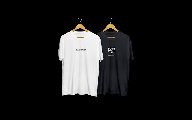
The t-shirt designs are intended to be a subtle way of spreading awareness for the campaign in a practical and fashionable way. Taking inspiration from the campaign with Mind and the EFL with their logo placement on all league and replica shirts, I did the same with my own t-shirt designs. The logotype and slogan are stylish, minimal and are versatile enough to work as an awareness campaign and as a fashionable item. The clothing items are intended to be worn in any situation rather than during this specific event to purposely as the wearer indirectly spreads awareness of the campaign further and longer than the campaign itself.    

The digital big screen advertisements are instead of or to work in conjunction with floor mural pieces of similar design. The pieces display factual information and stats in the form of infographic style designs, using the same negative space, contrast of extension and mix of typography style consistent with the various other mediums of the visual identity. The big screen boasts a series of varying pieces from different submissions so the digital pieces will be shown on a loop amongst a series of other submissions. For this reason, the pieces are stripped back, use a greater amount of negative space to contrast the often cluttered, bright, garish pieces that are shown on the screen. The off-white background of the piece means it will be incredibly bright when shown, which in itself will grab people’s attention.

The sticker/floor vinyl designs use the same design style, typography and negative space techniques to ensure consistency across all mediums. The stickers use a bright or textured background as well as the standard white black colour way or the rest of the identity because of its smaller form factor. The bright, bold colour ways will aim to make just as much as an impact as other mediums and these colour ways compensate for the smaller form factor these are designed in. Despite this, the stickers are versatile enough to be scaled up or down In size to allow for various uses and location placements. 

OUGD505 SB2 Design Development

I had a vague idea of what I wanted to produce in terms of visuals, it was more of an issue deciding on the name and the logo I was going to use. I usually work on the logotype and then flesh out a visual identity using the logotype and its design.


 I started with the literal idea of “talk” as the campaign name as its clear, direct and straight up. I didn’t have too much development for this as It was a very quick idea. I tried a sans serif that communicates a warm, welcoming, softer feel that would hopefully come across as more open to viewers. I tried a simple white/black white/sky blue to further exaggerate the soft, welcoming and comforting nature of the logotype. I didn’t go too far with this one as It wasn’t what I was aiming for, despite being a good idea I wanted something with more impact, something more stylised that would jump out at the viewer more.


I decided to look more into the idea of ‘not avoiding’ and decided that I wanted my entire campaign to revolve around this idea. The name is literal, straight to the point and relates to the entire campaign perfectly. I feel the name is a lot punchier and has the potential to grab a lot more attention than ‘talk.’ I implemented the same idea of welcoming, rather soft logotype design while implementing more a style I usually work in. Despite using the same ideals and implementing an initial minimalist style it was too basic for me, it was plain and didn’t have much personality, I also felt it wasn’t as stand out as id hoped.


I changed the weight of the logotype to something heavier, this gave the logotype a lot more purpose. As well as a logotype and name of the campaign, it was also the literal message, because of this it was important that the logotype stood out just as much as the rest of visual identity. It was important for me that the logotype was an integral and consistent part of the visual identity rather than a throwaway logo and campaign name, the idea of the entire campaign, each individual part being just as important was something I wanted to implement. The weightier type had a higher impact, stood out more and grabbed more attention. Type of this weight on a background of contrasting hue and harmonious negative space I felt would do well in grabbing attention.


I wanted the entire visual identity to be punchy, stand out and grab peoples attention, I looked at the idea of incorporating duel typefaces that would change randomly across each medium. I thought that this would make the design stand out more, be more attention grabbing and be more visually stimulating. I wanted to also relate my campaign more to the cause through my designs and using the mixture of typography would relate to often the struggle some men go through suffering from a mental health issue. Often with anxiety and its confusion, as well as the bipolar nature of some mental health issues, the switching of typography across the visual identity would relate to this, communicate this idea more clearly and be more visually stimulating and better and grabbing attention to viewers and passers by. I wanted to achieve this by using varying weights and contrasting serif and sans-serif typography. It would also incorporate a more stylised design style, in keeping with the clear minimalist style, but playing on current design trends as well as breaking up rather plain, standard design. The difference can be seen in the poster designs in the initial stages and the new mixed typography. The poster becomes more stimulating, the information becomes more striking, breaking up the negative space and working better in the space


I started with the idea of an application to work in conjunction with the campaign that would allow people to track their personal well-being. The app was simple and was design purposely not to be a solution to mental health, but rather a physical way of recording your general feeling with a general log everyday, more in depth questions, a tracker of these logs, daily inspirational quotes that may aid someone in a low period and quick links and phone numbers to local mental health charities in their area or popular mental health charities. I played with the idea of a live chat system as well. Despite thinking the idea was good and could work very well in conjunction with the campaign I didn’t have enough time to flesh the idea to more than the current designs and mock-ups. I tried implementing the mixture of typography across the application as well that’s when in the smaller format it became cluttered and less legible that the original, minimal style. If I had more time I would further develop the app and think it would be a really good idea alongside the rest of the campaign.


As well as being a typographic focused campaign, which aligned with both my style, minimalist styles, current graphic design trends and the idea of broadcasting a clear, de-cluttered message, I wanted to try broadcast various facts, stats and information about the subject in a way that still felt de-cluttered,  one that was legible, easily understandable from close and afar and bits that would break up a fully typographic project. I tried to do this originally in poster form, trying to convey the message with simple info-graphic style posters. I quickly decided it wasn’t working, they looked tacky and I personally thought they wouldn’t work on the street. I opted for a billboard style to broadcast the information and that seemed to work rather well. The billboard style allowed the information to legible, clear, and viewable from various distances, while feeling balanced, with the information, info-graphics and negative space working well together in the format. 


 The idea of the floor mural further progressed with the development of the billboard style design and was further condensed into a versatile package that incorporates type, negative space and the info-graphics well. The condensed nature of the floor mural design allowed for versatility in terms of scale and placement. It was clear that the floor mural piece would be too big a task to complete so the versatility of the piece allowed for changes in placement, such as on a billboard, digital screens, or poster designs if needed. 


Contact Mental Health Charities

I reached out to a few mental health charities like Mind Leeds and Andy's Man Club with the hope of a possible collaboration on my project. I wanted the Project to be more than a fictitious university module and thought it would be a great idea to try and get some charities on board. Leeds Mind never responded to my initial contact, AMC did however after further discussion I never heard back from them.


Contact Regarding Floor Mural

I reached out and tried to contact Leeds City Council regarding the floor mural. My initial contact was quick and went well. Although after further contact after these initial messages I received no response. 


Advertising Space Research

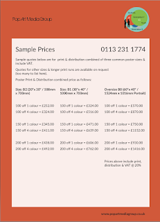
Having decided that I wanted to create something and spread it across Leeds i looked into the possibility of advertising space. I looked into poster bins and poster boards across the city in the hopes they were free or not too expensive. It became clear that everything said and done the posters would be incredibly expensive to advertise and wouldn't be possible in official locations unless mocked up.


OUGD505 SB2 Initial Ideas

I had a rough idea of what I wanted to do, I knew my subject matter and I knew that my project would be focused on creating awareness rather than solving a problem.


 I went into a crit where we discussed these ideas and it really helped with my initial idea generation. We were in agreement that the idea should be centred around tackling the issue head on to generate awareness, the idea of not avoiding, breaking down stigmas and grabbing attention with related and unrelated pieces. We had a few ideas that we threw around. Such as the idea of a floor mural, card games, physical things that can be interacted with that would interrupt daily routine and grab attention, but also something that isn’t instantly associated with the topic. It was even clearer that after discussions that locations of these pieces would play a huge role in the impact they would have, where do people congregate? What am I wanting to achieve? Do I want as many people to see this as possible at a glance or do I use placement to make sure a smaller number of people see the pieces but pay more attention to them? They were all really important thing to consider, which were all really good for idea generation, the possibilities to explore were vast, it was important that I condensed these ideas down to really fine tune and develop my idea. 

With a fair few ideas from the crit I went away and tried to decide upon what I wanted to do. I decided that I wanted to take inspiration from the likes of Carrolls’ poster series and the project 84 instillation and merge the idea of the two, while incorporating my own design style. I decided I wanted a poster series that all linked together but varies in design as well as a physical piece that can be interacted with in some way, directly or indirectly. 


 I quickly sketched down a few ideas that I could play around with, just to get a little bit of a clearer picture for myself. I looked at a large floor piece that would be displayed somewhere that sees a lot of foot traffic, as that would garner the most attention. The idea of ‘not avoiding’ was something I really wanted to try and push with my work after the crit, and the floor mural further backed up the idea of ‘not avoiding,’ being a large floor instillation, the idea was by making it large enough, people could not physically avoid the piece, having to walk over it or through it to get past, meaning while there was no direct interaction with the piece, there would be indirectly, as a guaranteed acknowledgment of the piece. I was still unsure as to where I would put this piece, all I knew is that the city centre would be the best area for the foot traffic, I had to consider a more specific place and look more into where and why this was going to be. I enquired with Leeds city council about the idea and whether permission was needed but unfortunately didn’t get a response.

I thought about the possibility of stickers as well as posters and the floor piece for a wider range of mediums and the possibility of more coverage, the stickers could be placed on things like lamposts, toilet doors, walls etc, places where they’ll come into contact with people and just reach a larger crowd.