The project centres around the theme of ‘not avoiding,’ the idea of not avoiding the very real issue of men’s mental health and physically not being able to avoid the campaign that’s intent is to be widespread in the city of centre of Leeds.
The project is made up of the campaign with its core ideas and a consistent visual identity across various mediums that support, relate to and advertise the campaigns ideas through minimalist design, colour theory techniques and mainly typographic based content. The project is made up of a poster series, sticker/floor vinyl series, billboard and digital screen advertisement with the versatility to become a floor mural piece and clothing.
The final logotype and name of the campaign is “Don’t Avoid It.” The logotype refers to the idea of not avoiding the subject matter and literally not being able to avoid the campaign and its various mediums around the centre of Leeds. The logotype incorporates the mixing of typography in keeping with the rest of the visual identity for consistency, using Neue Haas Grotesk Display Pro, weight 65 Medium and Bookmania Semi-bold. The mixing of typography and contrast between serif and sans-serif technique makes for a more visually stimulating piece of design, while playing on current design trends of similar nature, a break up of plain repetitive type and a relation to the idea of confusion, anxiety and bipolar episodes men often feel when suffering from certain mental health issues. The logotype is designed in a way that stays consistent with the rest of the visual identities design, as the logotype and name of campaign also serves as the message of the campaign and is equally important as the rest of the pieces in the project.
The poster designs are a series of posters that use the same minimalist, type mix design in varying different styles. The posters all use typography based design negative space and contrast of extension colour theory for balanced, harmonious posters of varying design. The posters are designed to be eye catching, striking and punchy, with a serious, semi-dark tone to communicate the seriousness and importance of the issue and the need to discuss the topic more openly and generate awareness. The poster designs display information, stats, facts and the campaign’s name and slogan in varying design styles. The designs use type and imagery to communicate the idea and also includes coordinates of Leeds city centre, the city in which they are spread across. The poster designs have potential to be scaled and are versatile in location placement, with the coordinates open to change, pinpointing locations of other pieces in the project such as the proposed floor mural or digital big screen advertisements.
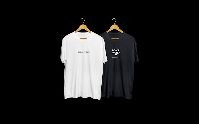
The t-shirt designs are intended to be a subtle way of spreading awareness for the campaign in a practical and fashionable way. Taking inspiration from the campaign with Mind and the EFL with their logo placement on all league and replica shirts, I did the same with my own t-shirt designs. The logotype and slogan are stylish, minimal and are versatile enough to work as an awareness campaign and as a fashionable item. The clothing items are intended to be worn in any situation rather than during this specific event to purposely as the wearer indirectly spreads awareness of the campaign further and longer than the campaign itself.
The digital big screen advertisements are instead of or to work in conjunction with floor mural pieces of similar design. The pieces display factual information and stats in the form of infographic style designs, using the same negative space, contrast of extension and mix of typography style consistent with the various other mediums of the visual identity. The big screen boasts a series of varying pieces from different submissions so the digital pieces will be shown on a loop amongst a series of other submissions. For this reason, the pieces are stripped back, use a greater amount of negative space to contrast the often cluttered, bright, garish pieces that are shown on the screen. The off-white background of the piece means it will be incredibly bright when shown, which in itself will grab people’s attention.
The sticker/floor vinyl designs use the same design style, typography and negative space techniques to ensure consistency across all mediums. The stickers use a bright or textured background as well as the standard white black colour way or the rest of the identity because of its smaller form factor. The bright, bold colour ways will aim to make just as much as an impact as other mediums and these colour ways compensate for the smaller form factor these are designed in. Despite this, the stickers are versatile enough to be scaled up or down In size to allow for various uses and location placements.


No comments:
Post a Comment