I also wanted to consider pieces, organisations or movements that not only relate to my subject but my practice, so I looked more into physical pieces that could possibly give me more ideas and help me with my own work.
Nichtsein
One of the first pieces I came across was Nichtsein, by Katerina Schwarz. The publication is an explanation of psychological, biological and cultural factors that can impact a person’s likelihood of experiencing suicidal thoughts. The book does this in a great mixture of visual and physical, interactive mediums that display various graphs, statistics and information in a rather beautiful way. The book is minimalist in design, de cluttered, using delicate sans-serifs and a simple colour palette to ensure the publications contents is delivered neutrally. The design of the publication is rather calming, soft and elegant. The idea of a physical that supports my idea is one I want to try and implement. The interactive nature of the publication is something I think would work really well in my work, being able to interact with my work I feel would also create more interaction with the topic.
Project 84
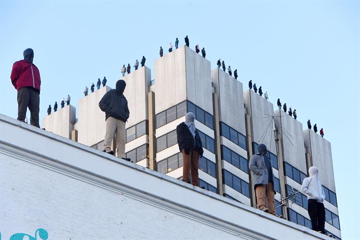
One of the most striking pieces I looked at was Project 84, by CALM and street artist Mark Jenkins. The piece is to generate awareness of male suicide, the focus of CALM’s work. Specifically, the piece depicts the 84 men that commit suicide a week in the UK. The Piece was installed on top of ITV London, This Morning studios. This is one of the hardest hitting pieces in terms of visual impact. It achieves its main goal of people stopping and looking, its usual, striking and rather shocking. Im aware I could produce something on such a large scale myself but looking at this will help inform my own work and give me a better understanding of what I want achieve. I want to create a smaller scale visual impact that will still make people stop and look, something that is unusual visually, something that isn’t normally there or something that is large enough to grab people’s attention. Something that breaks up regular scenery or routine that makes people stop and look.
Sad People Club
Sad People Club is a mental health awareness clothing line by Elisabeth Martel, a graphic designer based in Montreal, Canada. The clothing line is a selection of various garments and different abstract illustrations that aim to generate awareness for mental health in a comical, practical and fashionable way. The main garments are simple black and white tees with a minimal crying eye illustration, with “Sad People Club.” The design of the clothing is really clean, simple and stylish and something id personally wear myself. The idea of the clothing line is a really creative way of generating awareness of mental health, its unique and a more practical way of creating awareness. Awareness on a piece of clothing will last a lot longer than an event on a specific date, and will arguably come into contact with more people. The idea of using clothing to generate awareness is a really good idea, producing something that I would also wear outside of the project would only help generate awareness further, and something I really like the idea of incorporating.
Poster Pieces by Scott Carrolls
I had a vague idea of what I wanted to produce and I knew I wanted to incorporate a series of posters in some way. I looked at Scott Carrolls mental health poster pieces, which were shortlisted for the Design Change Makers Awards 2017. Carrolls was fuelled by his own personal experience with mental health and how he interprets the idea of having to “man up.” He wanted to create something shocking, something that would grab the viewers attention, in a location cleverly thought out and somewhere that would aid the point of his message. Carrolls’ approach to his work is one I want to use in my own. I want to take inspiration from the smart placement of his project and it direct relation to the projects impact and worth. I also want to take little elements of the shocking nature of his piece, not necessarily using techniques just like him, but the idea of something shocking, or straight up, no B*llshit type of way I feel would be more beneficial for my projects impact, would tie into the idea, message and desired reaction of my project.


No comments:
Post a Comment